Sunday, April 24, 2016

Reflection!

As the submission draws close, I am currently tidying and ensuring that my blog and portfolio are in order. This marks one of the last submissions i'll ever have at Abertay! It's been a ride. Looking back at the work i've produced this year, i'm a mixture of excitement, happiness and anxiety. When I began this research, I knew I wanted to produce concept art, for film, games, whoever would take it. From where I stand now, it seems that little bit more possible. Throughout the honours year, i've collated a pretty sizeable portfolio of work, and the brief chosen allowed me to explore many aspects of concept art, from blue-sky character sketches to high-polished environment art, concluding in my own published portfolio book, showing this process.

But enough about that, time to look over the project as a whole.
I believe my character design has improved in both a visual sense and a pipeline sense, meaning that i've improved in both creative abilities and scheduling. Each stage of iteration through the character design pipeline came faster than the last, and as I completed my project, I feel like I was at my peak ability, which is both something to be proud of and a curse, as I now look back at my earlier work and think "i could've done X or changed Y". But no matter, it just means i'm improving.


I think the pipeline is fairly clear, and the framework created throughout the project allowed for the interpretation and analysis of visual culture, which could then be applied to my own designs. As the document continues, I tried to steer further from the exact existing culture, creating my own concept designs imbued with this culture. 


Monday, March 28, 2016

Reflection on Character Designs

As a whole, I feel as though my character development skills have definitely increased since the beginning of this project. This may be a combination of multiple factors, such as improving my own visual library whilst analyzing all this visual culture data. 


 The characters weapons armour and apparel were all created with consideration to the analysed materials, and I tried to make their outfits seem as authentic as possible, as if they belonged to an existing culture. I decided to re-use the farmers hat in 2 designs, this decision was purely an aesthetic choice through iteration.
The textiles and patterns used in these concepts were lifted from the previously created pattern studies in order to imbue the clothing designs with visual culture. These designs were sourced from Han Dynasty textbooks and museum articles.

I tried to diversify these concepts after choosing them from a list of possibles, the rest of which were left at an earlier development stage. Each character design sports a different body type, as I tried to cover the spectrum of slim to muscular. Out of the designs, I believe the first design displayed here is the most effective. It's hard to tell whether or not this is due to my own visual preferences, or other factors like shading/detailing etc, but I do genuinely believe this character displays the strongest visual culture without it being too direct. I feel that the other 2 designs were strong, however I believe that they look a little to similar to the original culture, as opposed to generating a "brand new" one from the influence of another. 
One of the regrets I have as the submission draws near is the lack of full-colour character designs. This was just something i'd have liked to have included in the concept design document, but as I tried to focus on the true cultural designs behind the costumes, this became primary importance.

Monday, March 21, 2016

Final Image Process


This is the development process behind this particular final image. After consideration to a couple of the environment thumbnails, I combined 2 previous ideas. I liked the scale of image one, but the composition of the second thumbnail. I decided to try and create a valley of trees, as is prominent in modern depictions of Asiatic landscapes. Using the studies previously created from Bonsai and other familiarly structured flora, I set about creating this piece. The giant is dressed in a Hanfu, as previously researched. The oranges and purples used were inspired by the previous analysis of Tibetan monks, in co-ordination with the lush green natural environment. I'm fairly happy with this piece, there are a few things I would change for the future. The bright colour palette still seems a little too yellowed to me, but this is something weeks of staring at it has done. I'm happy with the scale created, and I feel as though the piece does ring slightly of a fantasy/Asiatic setting.


Above is one of the final images for my research project. I'm actually pretty proud of this. Also considering using part of it for the poster in the showcase. After analysing the designs of bonsai trees, and other flora native to Eastern Asia, I used the gained information to imbue this design with life, utilizing their colour palette too. In terms of success, I feel this piece was reasonably successful at incorporating the gathered visual culture information and displaying it as part of a concept art piece. 

Tuesday, March 15, 2016

Creating the Portfolio + Planning business cards

Creating the physical printed portfolio is an important end product to this research project. The layout and design of this particular aspect is not of highest importance in the grand scheme of things, however I still wanted a method of presenting the highest quality work produced throughout the research project.

As our display methods are limited to a PC monitor and an A2 poster, this book will allow me to physically display my work in more physical way. As well as these, I plan to print of some of the earlier development work to surround my plinth.

Once the final designs were settled on, I had to ensure each image was 300dpi, and the correct format for whichever printing method I decided on. (Blurb.com) Each file was resized and converted to jpg in order to correctly display. After testing how the images appeared on the preview prints, I fiddled with the levels, contrast and saturation of each image to ensure it would appear as intended when published. (Luckily, this didn't take ages as Blurb.com use a photo-style printing for true colour).
The designs were cropped and arranged in order to suit the format of the book. I have decided to print it landscape, as most of my images are suited to this dimension. I decided to keep the display portfolio simple and free from text. This was mostly because my images were all of varying size and dimensions, so I didn't want to clutter the book with unnecessary information. I'd like my practical work to speak for itself, free from additional font.


Above - laying out the images in Blurb


I decided to use one of the environment images as the cover for the book, cropped slightly in order to fit the page. I didn't want to put a huge amount of my time into making the portfolio book, as it was mainly the contents I was concerned with in this project. 


The image is a good precursor for what can be found within the book,, and I feel it creates a sense of atmosphere and wonder as the crop doesn't show the full, giant-including image. 

For the business cards, I chose the strongest 4 images from my portfolio, making sure to cover both characters and environment design in order to show off my work. 


For the back of the designs I decided that simpler was better, keeping it white with black text.


Tuesday, March 8, 2016

Rendered Character Pipeline

Creating costume-themed moodboards for visual research. I applied these to the existing character thumbnails i'd previously created, using the newly gained information to enhance the design of the character. This character started out fairly strong, but looking back i'm slightly unhappy with the finished look of the coloured sketch. I'm not sure if it's the flat background or just the shading I did but it sticks out for me. The colours chosen were referenced from previous studies into the costumes and clothing of the Han Dynasty, with this particular character wearing my stylized version of a Hanfu. 

With each set of character turnarounds, I tried to create a small variant in costume to allow for even more ideas to come through. This meant changing the outfit slightly, such as the image below where I removed the characters scarf and belt, whilst I made some design changes to the hanging parts of the silk robe.


Tuesday, March 1, 2016

Netflix's Marco Polo - Aesthetically Great, Historically Trash


Marco Polo is an American-made historical drama inspired by the great traveler Marco Polo, and his years in the service of Kublai Khan, ruler of the Mongol empire and founder of the Yuan Dynasty. Marco must learn the politics and culture of his new home, whilst his master strives to conquer the world in fire. Filmed in Kazakhstan, Malaysia and Venice, the series is aesthetically beautiful. Vast landscapes, sprawling deserts, and attentively detailed costumes are predominant throughout. More than $90 million was spent on more than 6,000 character costumes, and 15,000 accessories, in order to make the series believably 13th Century. The art direction relied on two costume designers, Timmy Yip (Crouching Tiger Hidden Dragon) and Jo Korer (The Duchess), who were tasked with outfitting hundreds of actors in costumes that were to appear to have been made 800 years previous.

Marco Polo incorporates a huge plethora of visual cultures, spanning the stylistic regions of Venice, Mongolia and China, In order to accurately understand and depict these cultures, Yip extensively poured over museum exhibits, films, history documentation, often travelling to Venice in order to work alongside tailors and tradesmen creating the costumes. In order to fully comprehend the extent of the costume design, Yip had many discussions with historical specialists.
The costume design team went to excruciating lengths to ensure each actor was costumed uniquely in order to stand out on screen, being adorned with many necklaces, belts, jewellery and apparel.
The production used at least 7 different animal furs to design the array of costumes, with each character having their own visual style and colour palette. The armour designs used throughout the show clearly differentiate the ranks of each soldier, with the higher ranking more wealthy characters adorning more expensive patterned items.

The series received mixed, predominantly negative reviews. This seemed to be mostly timeline-concerned, as many argued that many of the events that occurred within the series were gathered from a wide array of time periods, and were collated together in a manner that appeared disjointed and clumsy. Other historical inaccuracies included the Mongol court speaking in English (as opposed to Persian), and that the series depicted the Mongol armies breaching the Great Wall of China, a feat which was never achieved in reality.
Despite negative reviews and historical inaccuracies, our study lies with Marco Polo's visual design, as opposed to it's plotline.

Tuesday, February 23, 2016

Lake Giant Process


Gathering visual information on existing Asiatic architecture, using analysed imagery composed from Avatar and Pandaria studies, as well as further analysis into Han Dynasty architecture.
These allowed me to visualize the structures within the compositions, and further understand how this information can be utilized to enhance the concept art being created.


Using these designs allowed the foreground of the rough thumbnail to be composed, and adding the Asiatic motifs to the background structure design made the piece more uniform in terms of cultural influence. I tried to create a composition which fitted within the realm of the fantasy-Asiatic visuals I had researched in the case studies previously.


Iterations were made, and the scale of the giant figure was thought over at length. As I began to detail the higher-rendered piece, I realised the characters had lost scale, and I re-shuffled the composition in order to regain the feel of the first variant. The colours used here are mostly muted greens, blues and reds, hues which commonly occur in stylized Asian landscapes. For the giant design, I used one of the previously made costume studies from the Avatar case study, manipulating it to create a strong silhouette against the background. 


I am fairly happy with the finished concept. As each piece was created, I became more comfortable with my own painting techniques whilst considering the use of cultural influence, and I feel that my work reflects this as the project continues. I tried to achieve a painterly-yet believable look, detailing the most important areas of the piece whilst allowing for imagination and the rest of the piece to speak for itself. The buildings in the background were referenced using the previously generated architectural concepts, utilizing the tall spires and sloping rooftops of Asiatic architecture. The flora used in the piece were referenced from the tree/nature moodboards made previously in the project. With this I was trying to replicate the rolling landscapes portrayed in Pandaria, whilst pushing my own ideas and concepts. 


The piece was cropped for use in business cards and portfolio display, mostly due to the unusually wide canvas size used. This wasn't a failing, more just an inconvenience for certain formats. I feel as though this crop still stands pretty strong as a standalone concept.

Tuesday, February 16, 2016

Architecture Tests


Created some example concepts for what the architecture in my designs could look like. These were based off the existing studies done on the architecture and environments in the case studies, and in ancient Asia. Doing these tests meant I had a basis to build concepts on, drawing influence from the materials studied in co-ordinance with the criteria.                                                                           
Above  - Loose tests for environment piece, using the colour palettes gathered from the Water Tribe during Avatar: The Last Airbender analysis. 
This was dropped as part of the iteration process, as it seemed one of the weaker designs, and I was unsure how I could further include aspects of inspired Asiatic visual vulture. Further line and shape tests were made to further analyse the structures of ancient Asia, and concept sheets were made of my own concepts, imbued with this newly gained visual culture knowledge.


These are the architecture designs created, inspired from the studies on existing Asiatic and Middle-Eastern architecture. I was fairly happy with these, as I feel they display not only unique visual culture, but one that is reminiscent of the cultures I have studied to create them.
Taking these further, i'd like to take the stronger designs and create full turn-around images. I feel that some of the concepts would benefit greatly from a third dimension, and this may also help with scale. Small humanoid figures were added for scale, as many of these buildings were based on the tall stacked towers observed in the previous research. As well as this, influence was drawn from the previously created Sparth analysis diagrams, as I tried to keep the shapes simplistic, clean and effective.


The designs were coloured and textured using palettes and textiles created whilst analysing case studies and practical research. I tried to vary the textures and hues used in each design to allow for a wider range of unique designs to be made. 


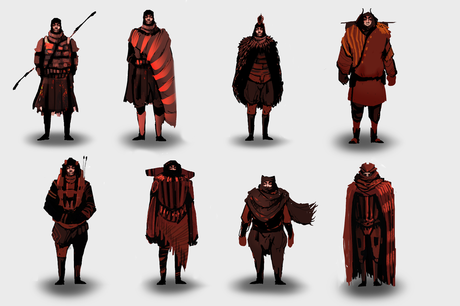
Character Design Reflection 


The above two images are boards of original character and costume designs, based on the studies previously created whilst analysing Asiatic visual culture and the case studies, particularly the Han Dynasty period. I am fairly happy with this outcome, as they appear to be the strongest character designs I have created yet! The colour palettes were heavily reds, oranges and blacks, as was the colours predominantly used in the cultures analysed. The use of Han-Dynasty costuming added a new layer of visual culture to the character designs, as well as suggested detail and personality. In particular, I like the second board, top right image as a character design and outfit. The form reads well, and is an effective example of the utilization of non-western influence in my own concept design.
The weapons on the characters person are typical staffs and spears used in Han Dynasty China, with some twists such as rifles and other details added to add my own flair.

For next steps, I will take the chosen figures and create turnarounds from them, or using them as smaller scale objects in larger concept pieces.


Avatar: The Last Airbender Analysis

Avatar: The Last Airbender is an American animated series featured on Nickelodeon from 2005 to 2008. The series is heavily inspired by Eastern Asian mythologies, in both visual design and plot/lore. Avatar was highly popular in the West, due to it's fantastical Asiatic style combined with relateable, western characterisms.
The show is set in a semi-magical world in which some characters can physically manipulate the elements using various forms of Chinese martial arts, this is known as bending.

The four prominent nations in Avatar are Earth, Water, Fire and Air. The idea of a set number of elements is popular in both Indian and Asian mythologies.  

Each elements "benders" use martial arts techniques based in existing fighting arts methods.

The fire nation use Kung Fu.
The earth nation use Hung Gar.
The air nation use Baguazhang, or "circle walking"
The water tribe use Tai Chi.

Costume:


Each nation features a bold and noticeable colour palette, allowing for the different cultures within the Avatar mythology to be distinct and individual.


Architecture/Environment

Avatar: TLA infuses it's environment with Asiatic visual culture, creating a unique yet familiar setting and mythology. There are many structures and locations within this series that are directly inspired from existing structures.
For example, the Air Temples in the series are very similar to the Temples of Bhutan, a real-life mountaintop temple.


These are costume studies created whilst analysing the materials provided by Avatar research. Each outfit is based on the various real-life Asiatic costumes represented in Avatar. These serve as both practical analysis and a good basis for designing costumes for the project.

Tuesday, February 2, 2016

Asiatic Architectural Analysis


                             Asiatic architectural analysis


After gathering various resources from books/historical articles, I used the information present to create a list of criteria which specifically detailed the recurring visual design factors of ancient Asiatic architecture. Using this list, I can give myself specific criteria in order to accurately draw inspiration from when creating designs. Some of these images were harder to research, as many of the ancient Chinese architectural structures were destroyed long ago. This was predominantly due to the beams and structures being made of timber, which is vulnerable to many of the elements.

Stacking, wooden-framed buildings (Lou):

These are predominantly composed of large column structures, often stacking and replicating many stories high. These are often broken up by pavillions and protruding ledges and rooftops.
The walls in-between these floors are permeated with doors, gates and windows.

Pavillions (Ting):

Chinese pavillions were usually made from wood or bamboo. These were built in various scales and shape, all of which feature large columns and no exterior walls.

Curved awnings/rooftops:

The true purpose of the Chinese tradition of curved roofing is often debated, and is unknown. However, the most accepted theory lies in the historical evidence that Buddhists believed that curves warded off evil spirits, which are imprisoned to move in straight lines. The curved rooftops were a spiritual safeguard to ensure that when evil spirits fell to earth, they would be fired back into the air.

Religious Architecture:

Buddhist architecture often featured large humanoid statues depicting deities such as Bodhisattva. Many asiatic temples had large courtyards filled with Buddha statues.


Character Analysis:


After gathering various resources from books/historical articles, I used the information present to create a list of criteria which specifically detailed the recurring visual design factors of ancient Asiatic clothing and uniform. Using this list, I can give myself specific criteria in order to accurately draw inspiration from when creating designs.


Hanfu (Hanzuang)

This is an essential silken robe worn by most of the Han Dynasty people. 
Usually resting around the knees, the Hanfu consisted of a tunic, an ankle-length skirt and was often tied with a rope or sash. As the class system developed, the length of the Hanfu became a measure of wealth and power. Men and women of higher class would wear longer, loose-fitting sleeves and adorn their robes with jade ornaments.

Above: Character clothing model created to represent the most common styles of clothing throughout Han Dynasty China.


Headwear

Headwear was often a method to show social rank in Han Dynasty China. Each social class had their own styled headwear from soft caps (mao) to more formal headdresses (guan). 


Pattern

The patterned textiles found throughout the Han Dynasty were all created through various means of loom. This means that there are certain significant patterns that repeat throughout a lot of ancient Asia due to this method of production. 

Popular loom patterned used throughout Han Dynasty China

Various gathered reference of textiles used during the Han Dynasty.
Predominant colours are gold, red and orange.


Tuesday, January 26, 2016

River Process

Studies were made of cliffs and landscapes commonly occurring in Asiatic landscapes.  From this cliff/lakebed study, it began the idea process which later resulted in a full concept piece. 


A rough concept thumbnail was made utilizing photobashing and loose colour techniques. This was based on the previous thumbnails created and was chosen for higher polish. I tried to replicate the feel of the dense forests found in Asia, as well as using the tree and rock studies created to enhance the piece. Using the critical framework for the research, following the fundamental development techniques to produce pipeline-efficient work.


Higher polish, beginning in greyscale to build values and scale. The 2 headed giant idea was inspired by the original Jack the Giant Killer tale, which features a wide range of humanoid giant concepts, most of which have multiple heads. I tried to create a sense of density and humidity, using the light reflecting from the lake to generate atmospheric mist and spray.


Using the greyscale image as a template, I applied colour via various layer settings and adjustments. This is one of the many ways I can generate images, but I used this method in particular in order to preserve the values and depth necessary to sell the atmosphere. The bridge used in the midground was inspired by traditional Chinese cantilever-style bridges, and was lit particularly to show this.  I tried to lead the viewers eye with this piece, placing the character at the front, leading the eye around the treeline or along the river to the Giant silhouette. A regret of mine here was leaving the giant's figure lesser detailed, as looking back I can see where I might've added additional detail. However, the fog and silhouette adds a certain sense of looming dread, so it works.
Below - Cantilever-Style bridge


Tuesday, January 19, 2016


Above - A study of some Middle-Eastern ruins for practice, and 2 possible thumbnails for further development based on Asiatic architecture.


World Of Warcraft - Mists Of Pandaria Analysis

World of Warcraft: Mists of Pandaria is the fourth expansion for the MMORPG World of Warcraft.
The new Asian-themed expansion introduced a new land to explore, a new player class and a new playable race, the Pandaren. Every aspect of the expansion is imbued with cultural inspiration from ancient China and Japan, from the Pandaren's Buddhist views and attitudes to the lush landscape of Asiatic rolling hills and willow trees. In order to understand how visual culture can be depicted in this example, character and environment areas have been broken down into key visual factors;


The Pandaren are a race of giant, humanoid Pandas native to Pandaria. They are seen as the game's first neutral race, where a player can choose their allegiance as a Pandaren. The Pandaren lore is influenced greatly by Asian cultures, and this is depicted visually in their armour and costumes, as well as their character traits.  


 Many of the NPC characters tend to wear silk robes and rice farmer hats, or sport hairstyles commonly wore in ancient Asiatic times. The jewellery and accessories adorning the characters are also heavily imbued with Asian culture, often depicting leaf symbols, crafted from Gold and Jade. Both of these materials were commonly used in the crafting of ancient Asiatic armour.
One of the first locations that a Pandaren player will encounter is the Wandering Isle. This lush valley contains many architectural elements which are directly inspired by real-world designs.
Many Asiatic motif's occur here, such as curved roof beams, gold inlay and red decorum. Pandaria features many rolling landscapes, lush forests and cloud-ringed mountains, all elements commonly found in traditionally Asian environments and landscapes.