As our display methods are limited to a PC monitor and an A2 poster, this book will allow me to physically display my work in more physical way. As well as these, I plan to print of some of the earlier development work to surround my plinth.
The designs were cropped and arranged in order to suit the format of the book. I have decided to print it landscape, as most of my images are suited to this dimension. I decided to keep the display portfolio simple and free from text. This was mostly because my images were all of varying size and dimensions, so I didn't want to clutter the book with unnecessary information. I'd like my practical work to speak for itself, free from additional font.
Above - laying out the images in Blurb
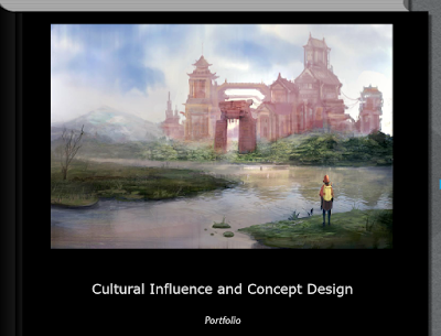
I decided to use one of the environment images as the cover for the book, cropped slightly in order to fit the page. I didn't want to put a huge amount of my time into making the portfolio book, as it was mainly the contents I was concerned with in this project.
The image is a good precursor for what can be found within the book,, and I feel it creates a sense of atmosphere and wonder as the crop doesn't show the full, giant-including image.
For the business cards, I chose the strongest 4 images from my portfolio, making sure to cover both characters and environment design in order to show off my work.
For the back of the designs I decided that simpler was better, keeping it white with black text.


No comments:
Post a Comment